

In response to a request from Vovi in the thread “Understanding the Work of Market Analysts,” Labacafe would like to share some charts that I have gathered.
In these charts, I have removed most of the indicator information, so they are for reference purposes only. These charts cannot be relied upon to predict whether prices will rise or fall.
Before we look at the charts, I would like to provide some background information.
In the financial and futures markets, experts and investors typically use two methods to make price forecasts. Liffe is considered a futures market where Robusta coffee is traded and serves as a guide for global Robusta coffee prices.
-
Fundamental Analysis: This involves analyzing information such as interest rates, inflation, growth, investment, etc.
-
Technical Analysis: This is based on three main types of information: past data, market psychology, and probability laws.
The chart is the “raw” result of analyzing past data. There are many types of charts, including candlestick charts, mountain charts, line segments, etc.
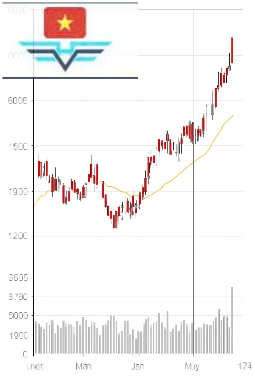
Notes
-
The chart’s density is daily, with the left column showing the price in USD per ton. The numbers marked as 5K, 10K, 15K correspond to quantities of 5,000, 10,000, and 15,000 (K = thousand).
-
The red line represents the daily closing price.
-
The yellow line (thinner) is the trend’s average price line.
-
The intersection of the two black lines marks June 10, 2010, showing price and trading volume information for that day, displayed on row 4 from the top.
-
The chart’s density is weekly, meaning that at the point where the two black lines intersect (June 7, 2010), the volume (57937) represents the total trading volume from June 7 to June 11, and the price is the futures price for July as of June 11.